(CNN) — CNN’s coverage of the 1980 US presidential election, broadcast just five months after the network’s launch, featured the analog predecessor of its now-essential election night prop: the “Magic Wall” electoral map.
Visible behind a dedicated Election Desk at CNN’s Atlanta studio, the technology was far from magical (at one point, a producer is seen updating the map manually behind the anchors, his back to the camera). But as results poured in, the undeclared states changed color, one by one, until Republican presidential nominee Ronald Reagan’s landslide victory over incumbent Jimmy Carter turned the orange map almost entirely… blue.
Over on NBC that night, newscaster David Brinkley joked that the western part of his network’s Republican-heavy map was so blue it was “beginning to look like a suburban swimming pool.” On CBS, meanwhile, Walter Cronkite told viewers that “the United States looks like it’s certainly red, white and blue… but mostly blue, tonight.”
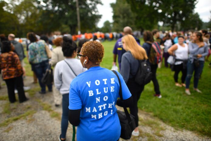
The idea that Republicans are red and Democrats are blue may, today, feel embedded in the symbolism, branding and vernacular — think “blue” states and “red” states — of US politics. But the current configuration has only been cemented in the public imagination since the 2000 US presidential race between George W. Bush and Al Gore.
Until the turn of the millennium, the colors were often the “other” way around. But which you saw depended on where you got your news — and when, given that outlets sometimes switched their color-coding between elections.
On that night in 1980, for instance, ABC was the outlier, showing Republicans as red, having used yellow for the party four years earlier. During the network’s 1984 election coverage, Brinkley, by then at ABC, offered a seemingly arbitrary on-air explanation for the decision: “Red, R, Reagan — that’s why we chose red.”
Colorful history
The GOP’s links to blue are far older than those to red. It’s an association that arguably dates to the American Civil War, when Abraham Lincoln’s Union Army was often identified by its dark blue uniforms, versus the gray traditionally worn by the Confederate’s military.
The shade was also actively employed by the party in the 20th century. Since the 1970s, as campaign branding became more sophisticated, the Republicans’ logos have largely been blue (though so, too, have the majority of the Democrats’ logos). At an election night event at Republican headquarters in Washington DC in 1984, a huge map was erected on the back wall, where organizers ripped away green covers from each state to reveal sparkly blue fabric for the 49 states that announced for Reagan.
Internationally, blue is often linked with wealth and conservatism, having historically been the most expensive color to produce. Red, meanwhile, has long been associated with radicalism.
Like the blood of workers rising against their oppressors, red features on the flags, logos and ensigns of left-leaning political organizations, from radical communists (think “Red China”) to the social democratic parties of Western Europe, Canada and Australia. As such, some of the earliest electoral maps, like Scribner’s 1883 Statistical Atlas of the United States, used a red-for-Democrat, blue-for-Republican scheme that would have been familiar to political observers outside the US.
Yet, neither party has ever had an official color. And for the media, this did not especially matter: Until the 1970s, election news was broadcast in black and white, while newspapers were mostly printed in cheaper monochrome, meaning contrast mattered more than color.
Network convergence
With the advent of color television, it was little surprise that the colors of the US flag became the predominant shades used by networks on election night. And when, in 1976, NBC launched an electoral map lit up by thousands of lightbulbs, it seemed only natural to stick with international norms — Britain’s, in particular.
“Without giving it a second thought, we said blue for conservatives, because that’s what the parliamentary system in London is, red for the more liberal party,” Roy Wetzel, then general manager of NBC’s election unit, told the Smithsonian Magazine in 2012. “And that settled it. We just did it.”
So, why did networks switch?
It’s a question with no definitive answer. From 1984, CBS joined ABC in labeling Republicans red and Democrats blue. CNN switched at the 1992 presidential election and NBC followed suit in 1996, though it chose more of a pink shade for that year’s Republican nominee, Bob Dole.
There is no evidence that the major networks actively coordinated; they may simply have copied one another until they all aligned with ABC’s arbitrary R-for-Reagan logic. After all, ABC’s evening news was, by the turn of the 1990s, the most watched among the major networks.
CNN staffers approached for this story recall aligning with other media to avoid confusing audiences. NBC News’ former executive vice president, William Wheatley, meanwhile told Vox in 2016 that his network had also decided to mirror its competitors’ approach “so as not to have a confusion for the viewers.”
And while it is plausible the Democrats had been unhappy about being associated with a color carrying negative, McCarthyist connotations (the anti-communist “Red Scare” will have been fresher in the memory in the years after the Cold War), there is similarly no evidence that networks deemed the association unfair, or that the party lobbied them to change.
The decisive election
If TV stations were broadly aligned by 1996, print media outlets still played by their own rules. Time magazine reported that year’s result with a map showing Bill Clinton as red and Dole as blue, while the Washington Post’s 2000 election front page also featured a color map marking Democrats as red.
Nonetheless, 2000 marked a watershed moment. And that’s because color-coded maps were, perhaps, never so important in understanding an election’s outcome.
Bush vs. Gore was among the tightest and most contentious races in US history. Amid recounts, litigation and a Supreme Court ruling on Florida’s decisive result (the state’s 25 Electoral College votes eventually carried Bush to victory), the election dragged out for over a month. Maps offered the media an invaluable way of communicating how the race had unfolded, nationally and within Florida, where individual counties were on a knife’s edge.
According to Washington Post research into newspapers, magazines and TV news transcripts since 1980, the first recorded use of the term “red state” in the media occurred on an NBC “Today Show” segment that aired a week before voters headed to the polls in 2000. But it was in the election’s aftermath that “red states” and “blue states” became so widely discussed that they entered common parlance.
This may have been because, that year, two influential publications had decided to use red for Bush: The New York Times and USA Today. A graphics editor for the former publication told the Smithsonian magazine: “I just decided red begins with ‘r,’ Republican begins with ‘r.’ It was a more natural association.” The editor who designed USA Today’s map meanwhile told the magazine that he “did it… because everybody was already doing it that way at that point,” adding that “if it had been flipped,” the country’s Republican-heavy center would have made the map “too dark.”
Regardless, the decision proved influential, according to Keating Holland, CNN’s director of polling and election analysis from 1993 to 2014.
“My firm belief is that the turning point in red/blue states was the national map (that) USA Today ran the day after the election in 2000, in which — for whatever reason — red was Republican and blue was Democratic,” he said over email.
From there, the color associations became shorthand for ideological positions. Declaring a state, county or individual voter as “red” or “blue” became a helpful way of framing political discussions, reflecting the USA’s de facto two-party structure and its all-or nothing, first-past-the-post voting system in which states are either Democrat or Republican, regardless of how close the result is. Purple, a mix of blue and red, eventually came to be the color of bipartisanship or swing states.
But not everyone made the switch. Dave Leip’s Atlas of US Presidential Elections, one of the oldest online sources of electoral data, still displays its maps the “other” way around. Leip, who founded the atlas as an MIT student after the 1992 election, describes his decision as “somewhat arbitrary,” half-joking in his website’s FAQ section that it’s because “elephants have a blue hue and donkeys have a red hue.”
He continues: “I was perhaps influenced by maps that I had seen in the distant past (I still remember the solid blue field of Ronald Reagan’s re-election in my hometown newspaper in 1984).”
Does it matter?
Colors may influence how we think and behave. Various studies have pointed to blue’s soothing effects, suggesting that we may be willing to spend more money in stores with blue interiors or that blue streetlights can prevent suicides and reduce crime. The color has also been linked to trustworthiness, dependability and stability.
Psychology researchers have meanwhile argued that sports teams wearing red are more aggressive and successful than those in other colors, although these findings have often been challenged — including by a recent meta-analysis in the International Journal of Sport and Exercise Psychology, which concluded that “carefully controlled empirical work on color in the context of sport is scarce.”
Research on the impact of color on political attitudes or voting behavior is scarcer still. But there has been some academic discussion about whether language that divides voters into distinct opposing camps promotes polarization.
In one of the few studies about the use of “red state” and “blue state,” Benjamin Gross, a sociology and criminology professor at New York’s St. Bonaventure University, analyzed newspapers’ use of the terms between 2003 and 2007. His paper concluded that “readers may develop negative stereotypes of their fellow Americans based on the development of stereotypical ‘red state’ or ‘blue state’ behaviors and beliefs.”
“(The newspaper’s usage) was not necessarily political, but it really did assume that the two sides are bitterly divided from one another,” he explained in a phone interview.
Speaking to CNN ahead of the 2024 election, more than a decade after his research was published, Gross said the terms now reflect a lack of mutual understanding and political nuance in an increasingly divided America, adding: “There wasn’t a whole lot of social media postings to analyze (when my research came out in 2013) but if I were to look at ‘red state’ and ‘blue state’ on Twitter hashtags, I’d be horrified to see what I might find there… I think ‘red state, blue state’ has really got into a very negative space where politicians and journalists talk about it more as a sociological fact.”
Gross said that the terms may fail to reflect the range of opinions that exist simultaneously within states, neighborhoods and even individuals. After all, if issues are neither black nor white, voters themselves are rarely entirely red or blue.
“Missouri might be a red state on election day, but you’re getting large pockets in Kansas City and St. Louis that are very blue,” he used as an example. “So, on the surface it may be that the Conservatives win in the presidential election, but there’s a lot of ‘blue state’ people in that area. Within any given geographic region, you’re going to find variants. A lot of people have said that the ‘red state, blue state’ idea is really an oversimplification.”
The-CNN-Wire


